You won't uncover many surprises when rifling through the Boston Bruins' extensive wardrobe over the years.
A Spoked B and black-and-gold color scheme have been mainstays on Bruins sweaters for decades now, with the Original Six franchise often opting to not stray too far from its bread and butter when it comes to its jerseys (at least, not as drastic as a few other clubs in Boston).
But, when you have a franchise that's been around for over 90 seasons ... let's just say, not ever sweater is going to be a winner.
We might get a reminder of that fashion faux pas in the near future, as the B's might be in line to add a fourth sweater to their collection of regular threads for the upcoming 2021 NHL season.
According to a recent story from Icethetics, the NHL could unveil a new line of jerseys for the upcoming season, centered on a "Reverse Retro" look that will harken back to some classic designs from yesteryear, albeit with a twist on the color scheme. So far, most of these leaked designs seem focused on rekindling the '90s era — in which bright colors popped through your fuzzy TV screens and "futuristic" designs (which really just meant weird zig-zags and oversized logos) were all the rage.
One design that has been confirmed is this — unique — sweater from the Dallas Stars (can of Monster Energy sold separately). If all of these new jerseys are following a similar script as this one, things are going to get WEIRD.
https://twitter.com/DallasStars/status/1321466764845338626
If Boston does indeed add another sweater to its rotation in 2021, they'll have plenty of intriguing options to choose from — and more than one design they should steer clear from. Here's one hockey writer's ranking of the top sweaters ever donned by the Black and Gold —starting with a couple of eyesores at the bottom (you know what's coming...):
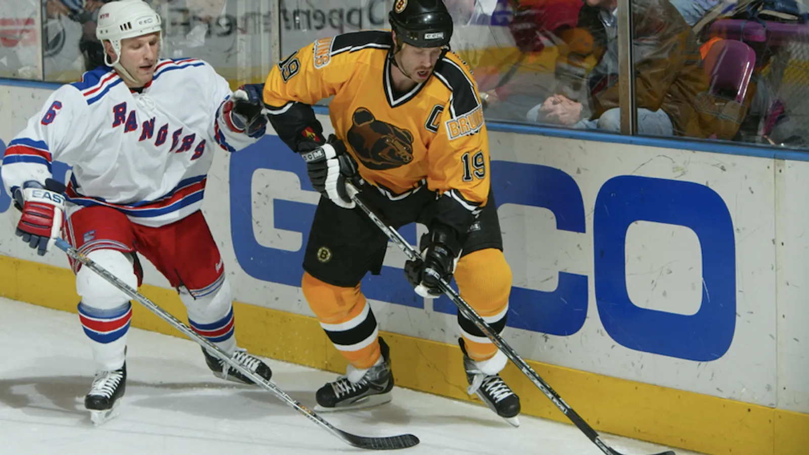
13. The "Pooh Bear" — 1995-2006

My best wishes to all you masochists who un-ironically endorse these hellish garments. "You either love 'em or you hate 'em" is the usual narrative when it comes to dissecting just what prompted the Bruins to sign off on (and actually wear!) this illicit incarnation of a hockey sweater. It's a getup so heinously mired in the '90s that you can actually hear the faint symphonies of AOL ringing in your ears once you've casted your eyes upon the tainted visage that is the "Pooh Bear".
Then again, this regurgitation of all that was wrong with that era of pop culture (Crash Test Dummies, BritPop, Tamagotchis, JNCO Jeans) might be why it's a prime candidate for a revamped "Reverse Retro" revival this season.
Maybe I'm being too critical here. I guess there is slightly something endearing about these sweaters, right?
The mustard-yellow coloring.
The zig-zagged trim.
The bizarre BRUINS stamped on the shoulder with a font befitting of a Michael Bay film.
And who could forget that glorious ursine mug adorning the front of the jersey — a work of art that looks like it was meticulously crafted by a kid finally given access to a Windows 95 Clipart program.
Yeah, you know what? No, there's nothing endearing about these. The last thing we need as we close out 2020 is a sanctioned resurrection of these dreadful threads. Burn 'em.
12. The Old-Tyme Alternates — 1940-1944

Now, brace yourselves — you're going to see a lot of similar variations of the tried-and-true Spoked B design further down on this list. Given how often Boston decides to not stray from its comfort zone when it comes to sweaters, I almost feel bad docking a jersey like this that, at the very least, is different. Still, there isn't a whole lot that sticks out here, with the cursive Bruins stitched on the front just not enough to salvage a pretty bland assortment.
(To keep this list from dragging on into the next month, we're going to cap our rankings at sweaters from 1940 and beyond — especially given that a number of older designs were revived in later jerseys, especially for special events such as Winter Classics).
11. Enter The FleetCenter - 1995-2007

